Showing posts with label sediment. Show all posts

Wednesday, 5 June 2019

Making waves and moving sediment

Dr Hannah Williams has been a Post-Doctoral Researcher in Physical Geography at the University of Hull since April 2017. Hannah is part of the Hydralab+ project, a large European project that brings together researchers to improve experimental hydraulic research to better address climate change adaptation issues. Here she talks about a recent set of experiments carried out at the Total Environment Simulator.

Mixed Sediment Beaches are commonly found at high latitudes around the world, including amongst other locations, along the coastline of the United Kingdom. These types of beaches can consist of a mixture of both sands and gravels, and behave differently under hydrodynamic forcing, such as waves, to those made up of a single sediment size. Although some research, mainly in the 1970s-1980s, has been carried out to gain an understanding of the morphological behaviour of these types of beaches, little is still known about the variations in the morphology of these beaches due to mixed sediment, and how they respond to the hydrodynamic conditions.  The aim of this study was to try and gain some insights into beach response using a physical model.

At the University of Hull, we are lucky that we have a large experimental flume available for research called the Total Environment Simulator (TES). The TES has a working area of 11m by 6m, and is equipped with pumps to allow recirculating flow and sediment, a multi-paddle wave generator for the generation of both regular and irregular waves up to ~0.3m in height (depending on water depth), and finally is equipped with a rainfall generator sprinkler system on the roof. During my time at the University of Hull, I have been involved in experiments using all of these systems, demonstrating just how versatile the flume is. The photo below shows the TES when it first opened in 2000. As a well-used facility, it doesn’t look quite so clean anymore!  


For these particular experiments we were only interested in the beach response under wave loading, so only the wave generator system was required. We constructed a large beach across the opposite end of flume, with a height of 0.8m at the rear, and extending 5m towards the wave paddles. This gave the beach an initial gradient of 1:7.5.To obtain a mixed beach, we chose two different sediment sizes with a large difference in diameter. The fine sediment had a D50=215μm (often known as play sand as it is commonly used in children’s sand pits), whilst the coarser sediment had a D50=1.6mm. To construct this beach, this required over 5 tonnes of each type of sediment (and this including bulking out some of the area deep underneath the beach with breeze blocks), which all had to be lifted into the flume and distributed by hand. The photo below shows the initial smooth beach conditions. 


In terms of measurements, there were two main parameters we were interested in, firstly the incoming wave conditions. To measure these, we had 8 acoustic wave gauges distributed throughout the flume (see below). These recorded information about the wave heights and periods, from which we can gain an understanding of the transformation of the waves as they approach the beach. 


The second parameter we were interested in was the beach morphology. To measure this, we deployed a Terrestrial Laser Scanner. This was mounted from the ceiling above the beach. After each experimental run, the water was drained from the flume, and the 
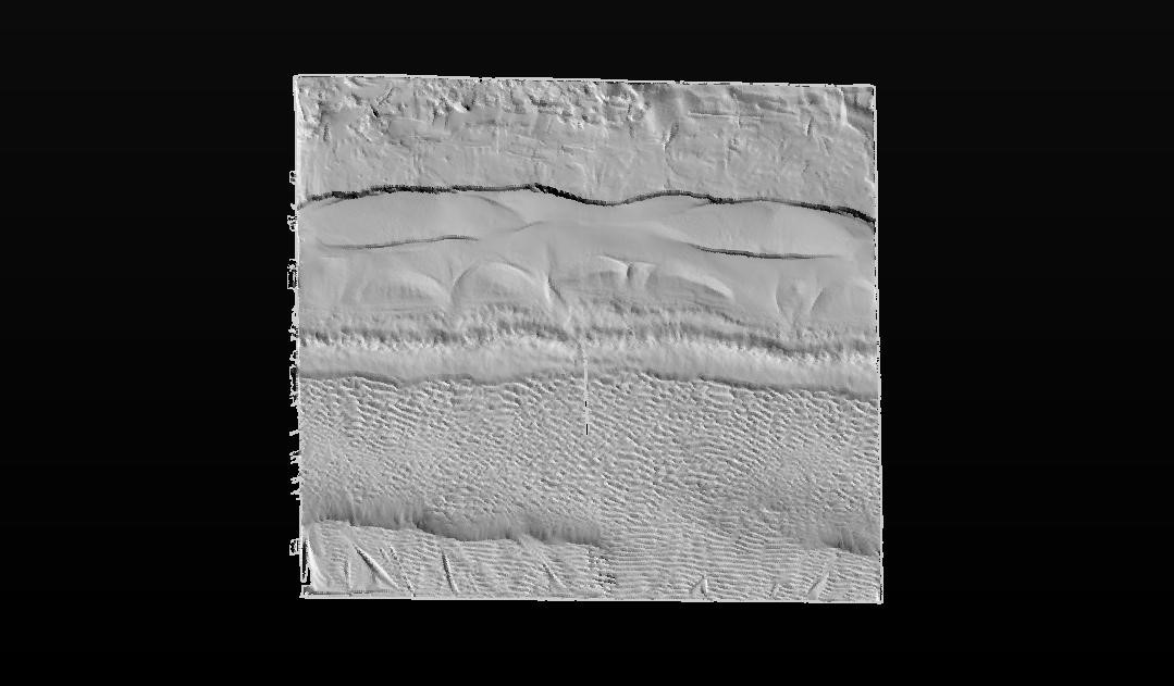
scanner carried out a full 360 degree scan of the beach surface.The image below shows an example of a TLS scan, in which you can clearly identify the top of the swash zone, as well as a berm which has formed part way down the beach, and ripples in the lower section. 


For the actual experiments carried out here, we attempted to replicate some of the influence of the tidal cycle on the response of the beach. The experiments were run at three different water depths, namely 0.3m, 0.4m and 0.5m. In three of the experiments, we hit the beach with an initial storm (H=0.18m, T=2.2s, where H is wave height and T is wave period), at different points in the tidal cycle. One at high tide, then one at mid-tide on the flood tide, and one at mid-tide on the ebb tide. The purpose of this was to try and investigate the effect that timing of the storm with relation to the tidal cycle has on the beach response. After each storm a number of recovery events (H=0.10m, T=1.5s) were carried out, at each depth to complete a tidal cycle. The video below shows some of the experiments in action.


Using the laser scans, we can also examine the differences between scans, giving us an idea of the evolution of the beach throughout the experiments. From these we can obtain information about the amount of erosion and accretion at different points of the beach, and examine if this is different depending on when the storm occurred. The image below shows an example of a Digital Elevation Model of Difference, from which a number of interesting observations can be made.  It should be noted that Red shows accretion of sediment, whilst blue shows erosion of sediment. 


The very top of the beach remains white, this shows that the beach level here remains constant throughout the experiments, due to the wave run-up not reaching this point. Just below this section is a large area of erosion, this is the swash zone, where waves are breaking. This is a very energetic area which results in a large amount of sediment transport, mainly transported further down the beach to the zone showing large accretion. This is known as a berm and often forms as the wave deposits sediment. Below this area, it can be seen that ripples form. This is prior to the wave breaking where sediment movement occurs in an elliptical motion, forming small ripples on the surface. These are all features that are not unique to mixed sediment beaches, however, one feature that is, are the beach cusps. These can be identified in the figure by the regular arc shapes present. There is limited information on the origin of beach cusps, but once they have been created they are a self-sustaining formation. This is because as a wave hits the area of the beach with the cusp, it splits at the point and the water is forced either side. As the wave then breaks, the coarser sediment falls out of suspension and is deposited on these points (known as horns), whilst the water flows into the arc (also known as an embayment) where it in turn erodes out the finer sediment.

These experiments have only just finished, so analysis of the results is still on-going, but hopefully we will have gained some useful insights into the behaviour of mixed sediment beaches which can be used to help devise beach management plans in the future.

For more information on the work of the Hydralab+ project, then please visit: https://hydralab.eu/ 

Wednesday, 4 September 2013

Getting Animated

Getting Animated by Chris Skinner (@cloudskinner)

The formal presentation of research in academia is pretty traditional. I doubt it has changed much in the last 500 years, if not longer, and for a progressive sector of society it really does not look set to change. Basically, you get your results, write it up as a paper, some experts look it over and request more details or changes, you do them, they pass it, you get published.

The published article then goes into a journal. Most of these are still printed but are available, usually as a PDF file, electronically. This is where the embrace with the modern world ends. I mainly read articles either on my computer or my tablet – most articles are formatted into two columns on a page which makes it very awkward to read off a screen. So optimisation for electronic presentation is not high on publishers’ agendas it would seem.

But are we missing out? A magazine I have been reading since I picked up my first copy in October 1993 has changed many times in the last two decades. It isn’t a science publication but is related to a hobby of mine, and last year they started publishing a version of the magazine optimised for the iPad. They could have just bunged out a PDF of the paper copy, but they knew that the new technology provided them with a platform to support more content. In place of a photo there is an interactive 360º image, instead of a price list for new products there are hotlinks direct to their entry on the online store, plus there’s additional videos, interviews and zoom panels. If the magazine contains typos or erroneous details, it is automatically updated. The company have started rolling out this idea to their other printed materials.

What if these ideas were used in academia? What sort of content could we include? The most immediate thing that springs to my mind is animations. I produce tonnes of them, and conference presentations aside, they rarely get seen outside of my research group. Why do I make them? Because they are useful for very clearly showing how systems work, if your model is operating how it should or demonstrating patterns in data - (*Thanks to @volcanologist for pointing out that animations can sometimes be submitted, and hosted on a publisher's website).

Take for example some work I have been doing on historic bathymetry data from the Humber estuary. Bathymetry data are readings of water depth at the same tide level, and I use the data to create maps that show the shape and elevation (heights) of the bottom of the estuary. To find out more about what estuaries are, take a look at Sally's previous blog.

Provided by ABPMer, the data spans a period between 1851 and 2003 – I processed the data, calculated rates of elevation change between each sampling period, and from this produced yearly elevation maps. By putting these together as an animation I could see the evolution of the data (it is important here to stress the difference between ‘data’ and reality - not all areas of the estuary were sampled by each survey, and the number and locations of reading varied. Much of the change seen in the video is because of this and not because the Humber has actually, physically, changed in that way).


What immediately struck me was the contrast between the middle and the inner estuary. The middle estuary is the part between the Humber Bridge and the sea, where the estuary’s course deviates southwards – it is remarkably stable over the 150 or so years. The inner estuary, from the Bridge towards Goole, sees lots of internal changes – driven by interactions between the river inputs and the tides – but overall very little change. The Mouth of the Humber, the part closest to the sea, looks to see little overall change, but most of the variations seen in the animation are due to differences in sampling point in the data, and not actual changes. Similarly, changes around the banks of the estuary observed in the animation are most likely caused by sampling difference in the surveys, rather than actual elevation changes.

I have recently been continuing work on adapting a landscape evolution model, Caesar-Lisflood, to model the Humber estuary, and a big step towards this is to accurately model the tides as they are observed by tidal stations recording water depths. Numerically we can do this, but it is important to check that the model is representing the tides in a realistic way - this is a very important step in making a model as it has to be able to accurately simulate observed behaviours before you can experiment with them. Again, animations are a really useful tool for doing this.


The video above shows the variations of water depth throughout several tidal cycles, as modelled, with light blues as shallow and dark purple as deep water. The model changes the depth of the water at the right hand edge in line with water depth data recorded from the Spurn Point tidal station near there. The water then 'flows' from there, down the length of the estuary as the depth increases, and vice versa - this simulates the tides going in and out.

From this I can tell that the model is operating well, as the tide is advancing (coming in/going up/getting deeper) and receding (going out/down/shallower) as expected, throughout the whole region and not just at the points where the tidal stations are located. You'll notice that the early part of the animation shows the estuary filling up with water - this is part of something called 'spin-up', where you let the model run for a period of time to get the conditions right before you start the modelling. In this case it is a 'day' as the water levels gradually builds, filling the estuary.

Another check would be the velocity of the flow as the tide floods and ebbs - this is the speed with which the water is moving (both in or out). The velocity should increase as the tide advances or recedes, but slack water (where the water is hardly moving at all) should be observed at high and low waters. If the model is working as expected, the area of slack water should progress from the sea and up the estuary towards Goole. From the video below, this is seen to be the case. Light blue shows low flow speeds, and darker purples higher flow speeds. The video shows the same modelling procedure as the previous video.


This type of content is really useful to me as a modeller. It is also really useful for presentations as I can show a group of people something that takes a few seconds, yet would probably take a lot of slides and quite a bit of explaining. If academic publications were to begin to include enhanced content in peer-reviewed publications, I believe this could advance the communication of research, not only to other researchers but also to the wider public. For now, Blogs, like the GEES-ology one here, are the best outlet. I hope you enjoyed the animations!